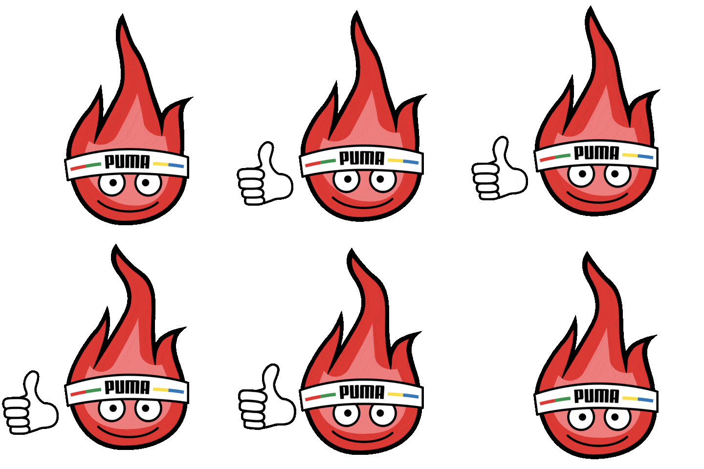
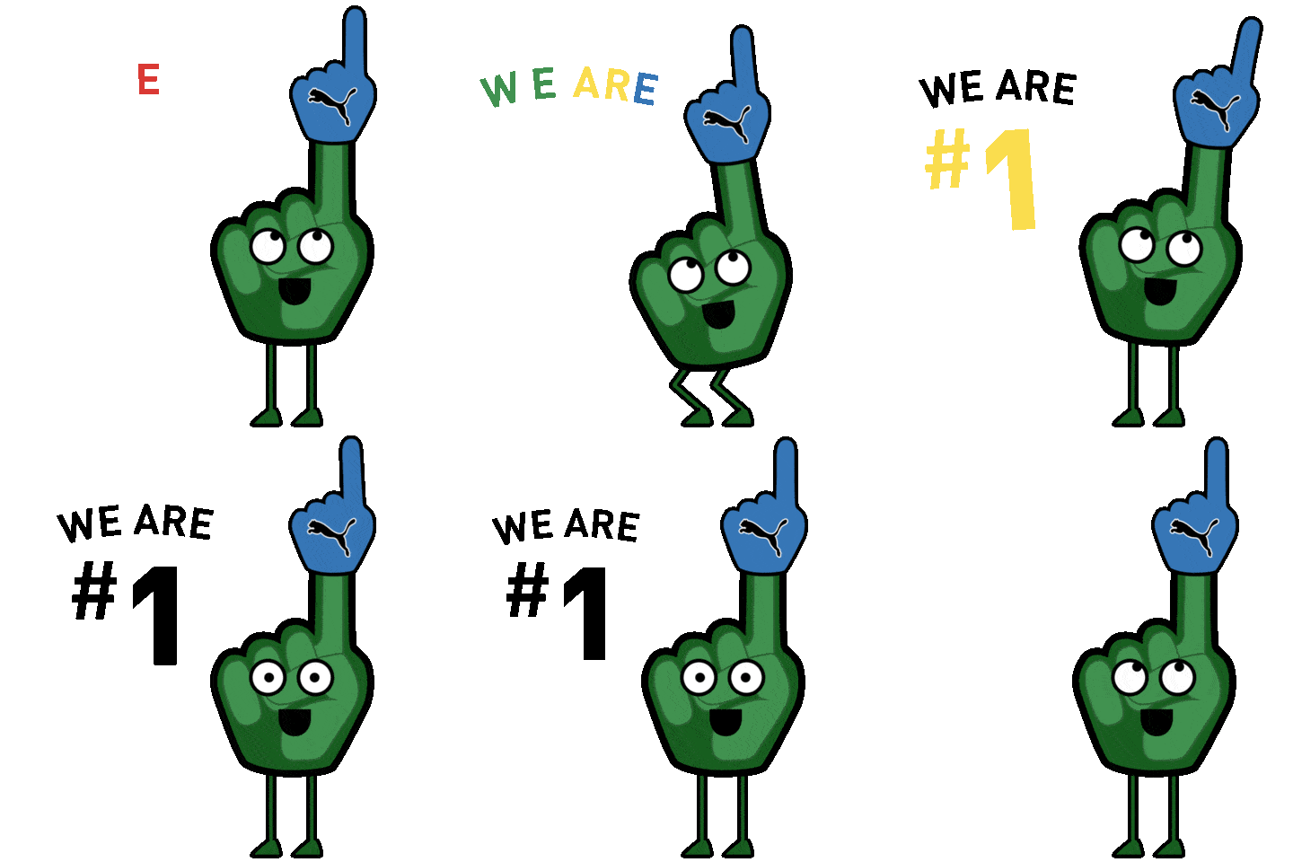
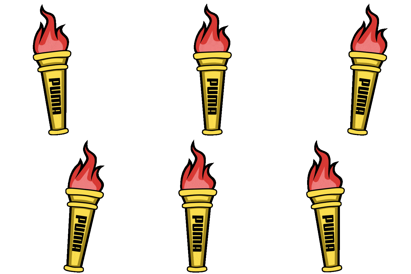
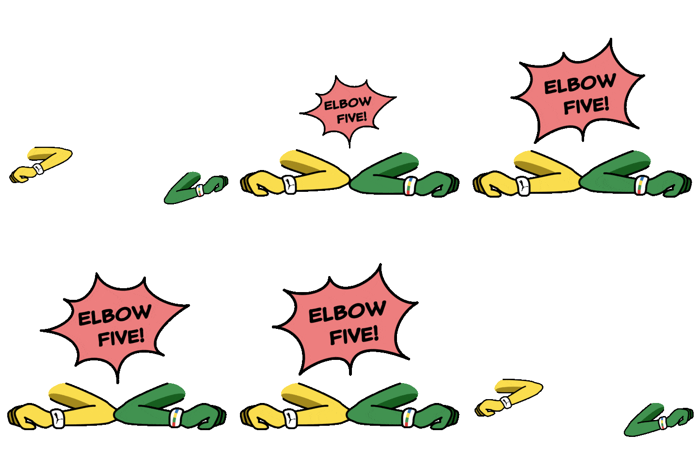
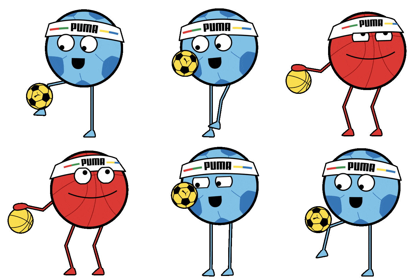



In collaboration with Fresh Tape Media, I set up PUMA with a fresh set of GIPHY stickers to commemorate the release of their new "Unity Collection" apparel line.
Art Direction
Puma was interested in a clean, vector graphic visual style pointing to the likes of Burnt Toast (https://www.behance.net/BurntToast), joe b (https://www.behance.net/joejr), and Mat Voyce (https://www.behance.net/matvoyce). The visual style also had to reflect the red, green, yellow, and blue color scheme for the branding of the new collection.
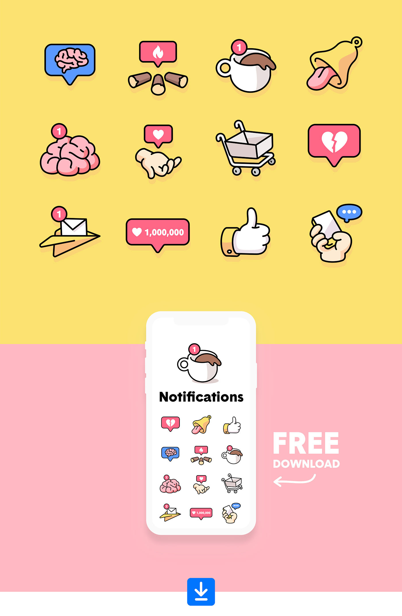
Artwork by Burnt Toast
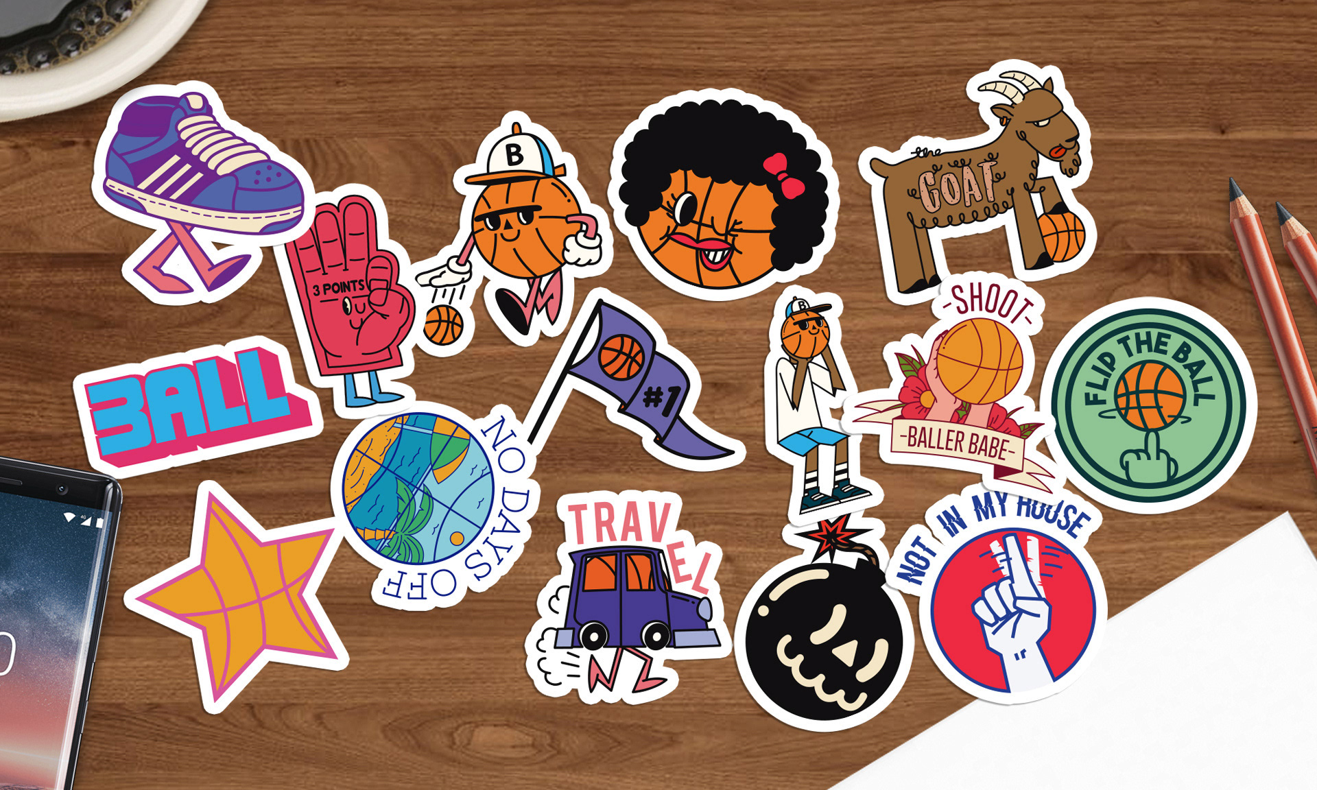
Artwork by joe b

Artwork by Mat Voyce

Puma Branding
Initial Illustration Exploration
For my initial illustrations, I clung tight to the provided Puma branding and used the colors only for very small accents.
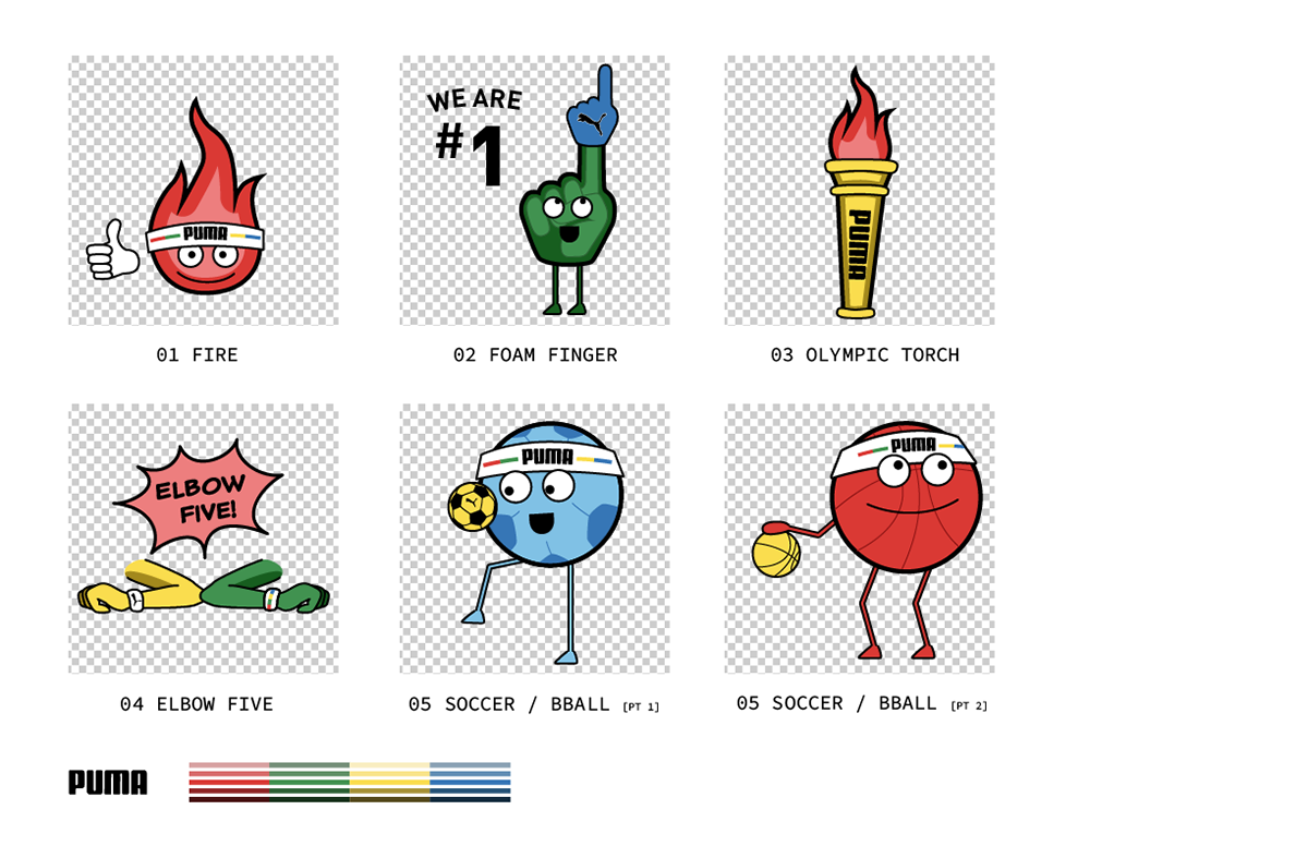
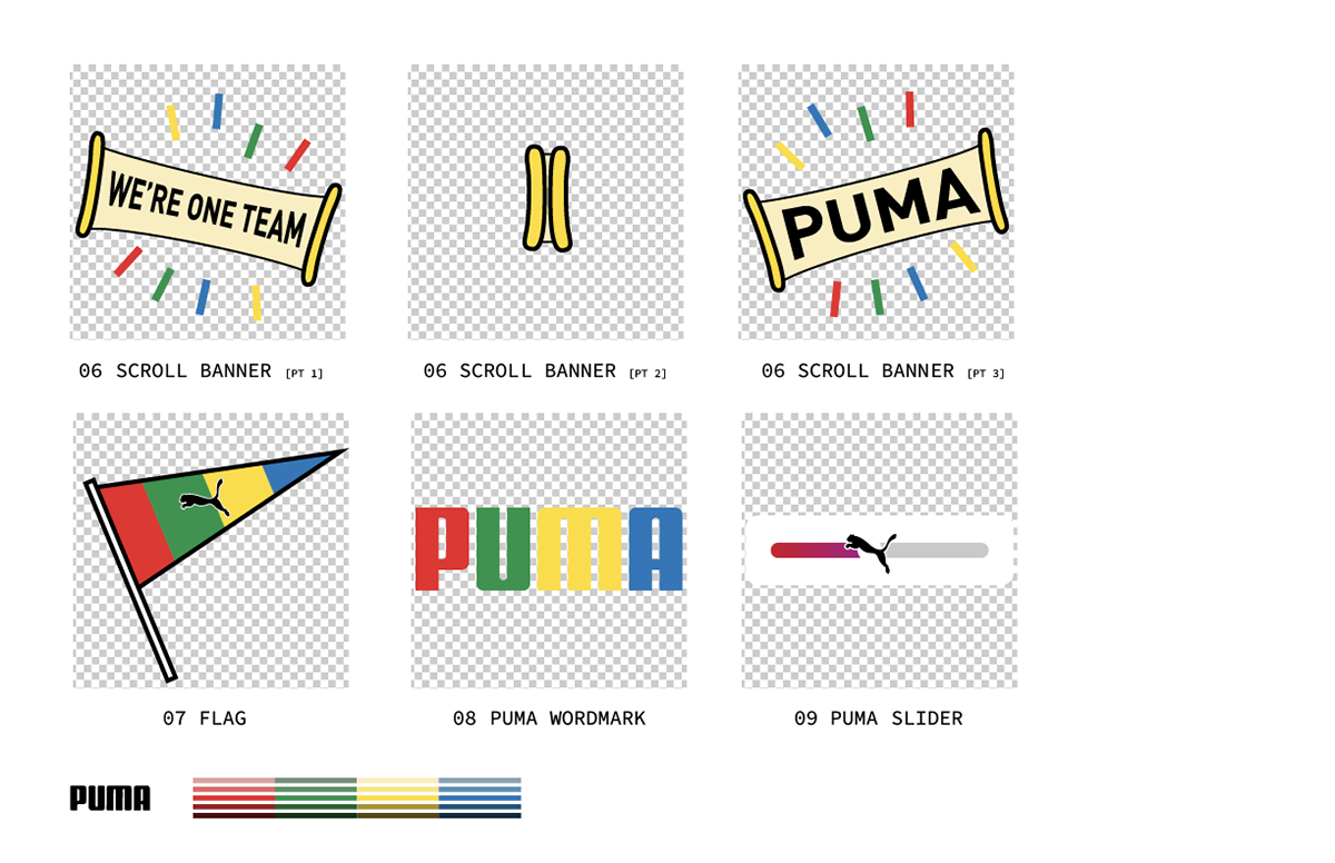
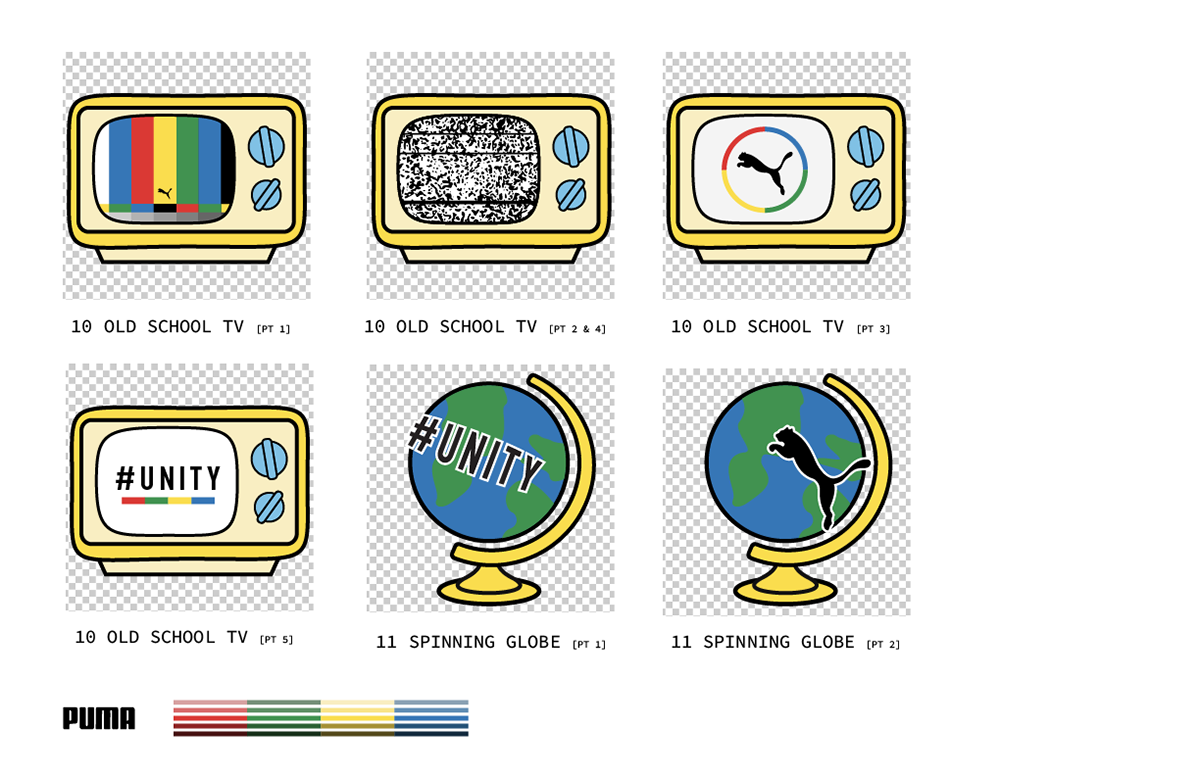
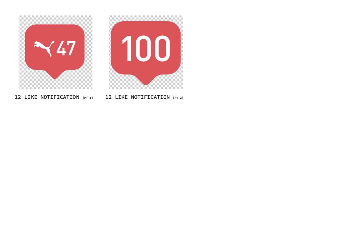
Final Illustration Deck
Feedback from Puma steered me towards integrating more color. Plus, the spirit of the illustrations really lent themselves to being full color, so I expanded the palette a bit with low saturation and darker versions of the primary colors to nail down our Illustrations.
Sketches
Pencil on paper is my usual preference for preliminary illustration.